Warsaw-based graphic designer Jan Bajtlik, 25, is a member of the Polish Association of Fine Arts in Warsaw. He has designed several children’s book, as well as posters and illustrations. His work was published in Time, The New York Times and Libération, as well as the Polish press.
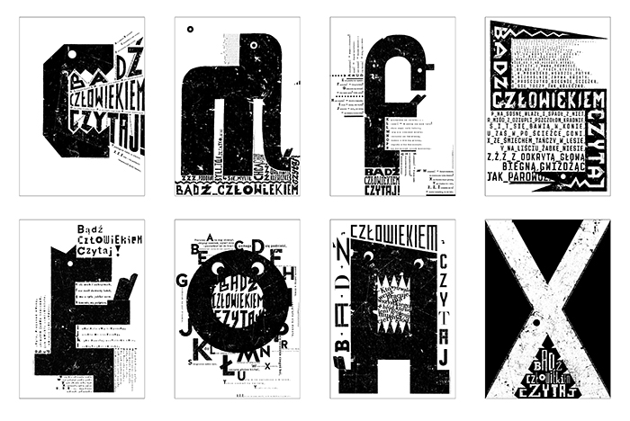
“I graduated last year with a master’s degree from the Academy of Fine Arts in Warsaw. I obtained two degrees, in graphic design and book design. For the first, at professor Lech Majewski’s graphic design studio, I designed a series of posters promoting reading.
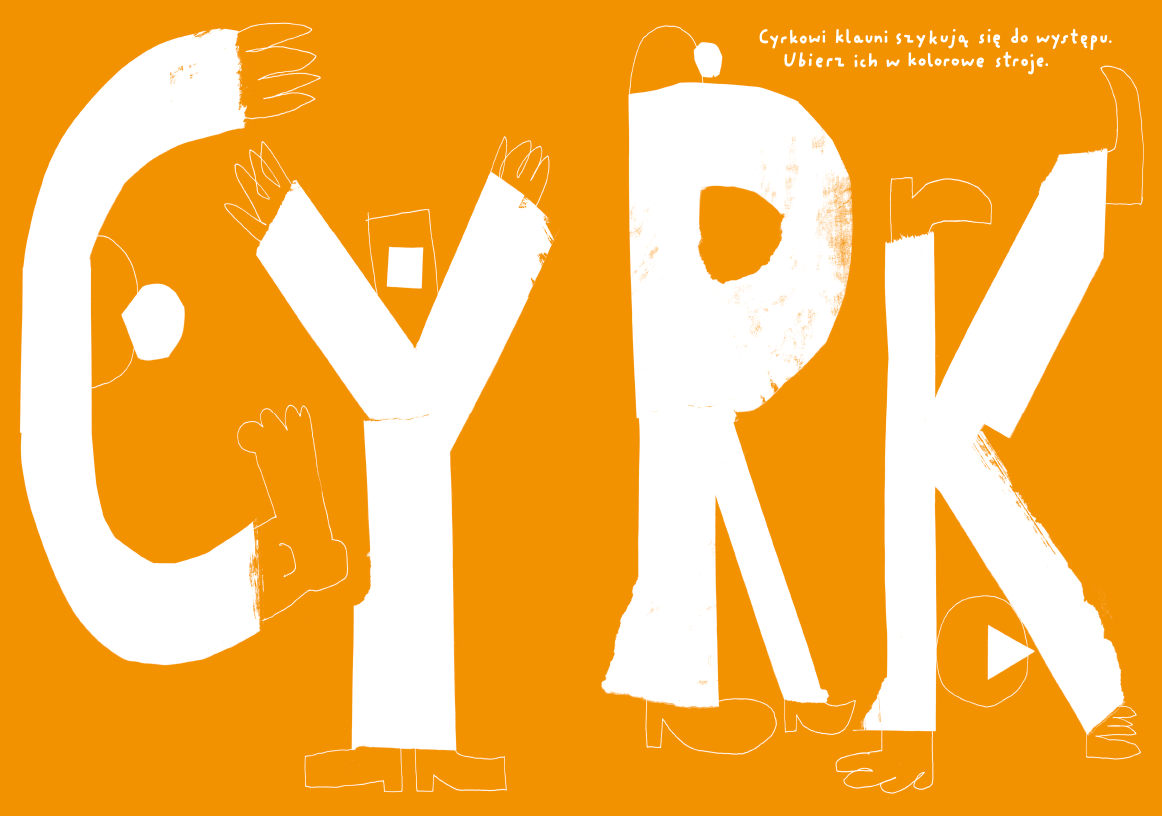
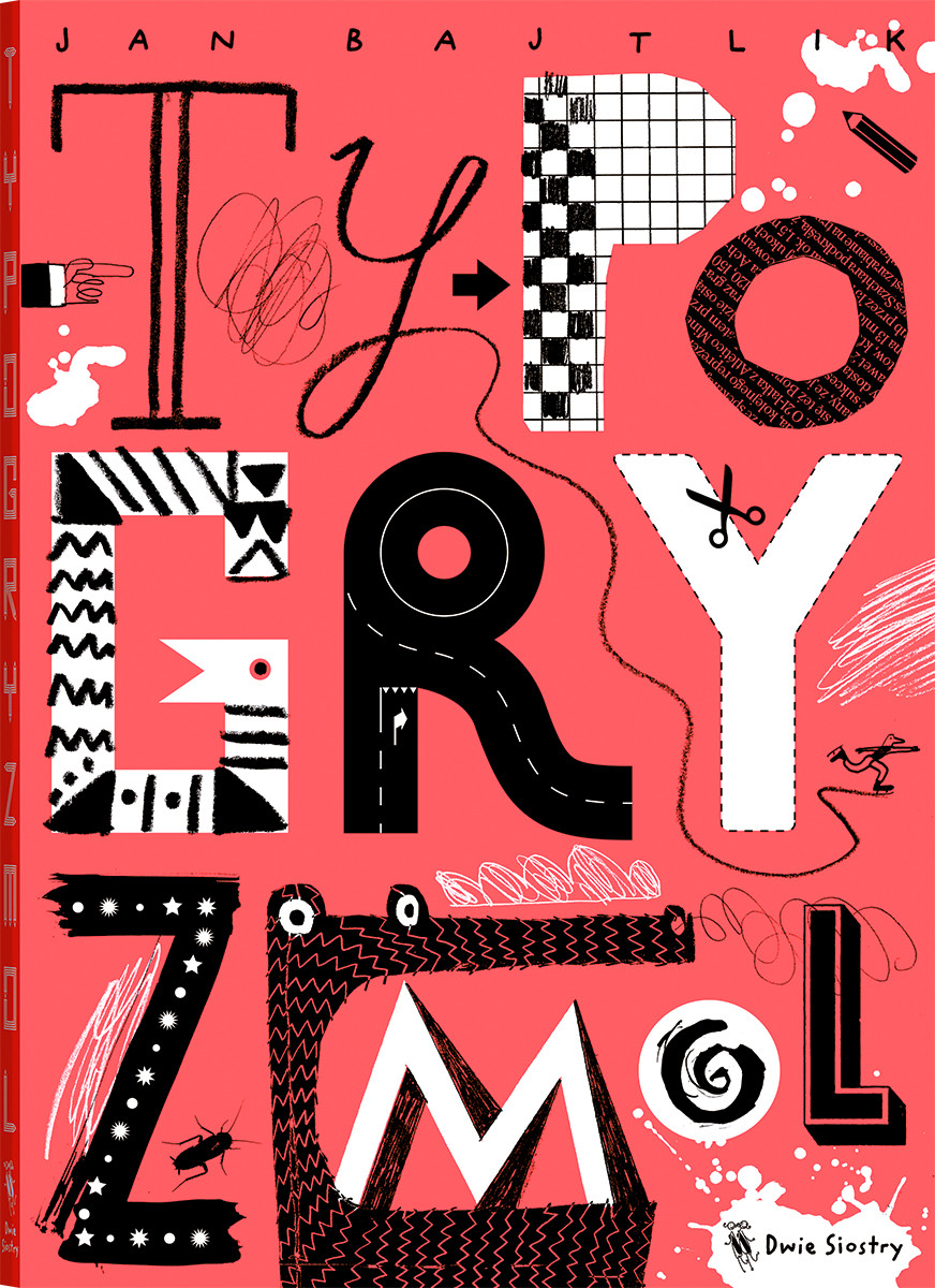
Beyond that, I made a book for children aged 6 to 7. The book, Typogryzmol, is meant as an introduction to typography — children can play with the letters and draw. I set up workshops in schools in Warsaw and elsewhere in Poland. In my opinion, the main problem is colouring books. Parents should give their children books that help them broaden their minds. Coloring books are stupid because there is no creativity involved. I gave the children in my workshops brushes, black ink and large sheets of paper, and I just encouraged them to move the brushes over the paper and scribble.
My book is partly about scribbling and partly about typography. It’s an activity book. One spread introduces a letter, the next one is about drawing for fun. It’s an activity book. I found a publisher, Wydawnictwo Dwie Siostry, and the book was released last week.”
“For my second master’s degree, at professor Maciej Buszewicz’s book design studio, I conceived an edition of Umberto Eco’s novel The Name of the Rose. I concentrated on the notion of the labyrinth, which is central to the story. I ended up creating a labyrinth within the book. I inserted 20 long quotations about labyrinths from other books in the main text, and they pop up each time Eco mentions the library in his novel — the library in The Name of The Rose is constructed as a labyrinth.
I excerpted several classics of literature, including Dostoyevski’s Crime and Punishment, Ovid’s Metamorphoses, Joseph Conrad’s Heart of Darkness, and The Library of Babel by Jorge Luis Borges, but also scientific texts. I used a completely different layout for each text, keeping a conservative look for Eco’s novel. It was a great exercise.”
You began doing commercial work — most notably, illustrations for Time and The New York Times — while still a student.
“I was very happy to finally obtain my diploma, exactly because I was studying and working as a freelance graphic designer at the same time. I would spend my days in school, painting and drawing, and work nights. I spent three years studying traditional lithography, and on top of that, I was travelling in different countries maybe four months a year. There wasn’t any time left for big projects.”
“I was given interesting commissions early on, and that was enough for me to survive. After a while, I realised that I somehow existed on the market and that I now had a career. I recommend my younger friends to do the same —start working as a student, because you will learn how the industry really works. For instance, printing techniques. In school, you tend to print digitally, whereas in a professional setting it’s all offset.”
How is the situation in Poland for graphic designers?
“At the moment, there is a renaissance of children’s book design. People of my generation and slightly older designers and illustrators have done really great stuff. Several books were translated. My publisher is trying to sell the rights of my books to other markets, and I hope that at some point I will exist outside Poland.”
“There is a lot of ambition in Poland right now. Thanks to the EU, and travelling, and the information we can get on the Internet, my generation has a completely different view on things, compared to our parents. I have no problems living in Poland, and my situation here is not that different from designers in other European countries. Publishers give us a lot of freedom, and there is an audience that buys our books. That said, the Ministry of Culture and other public cultural institutions have yet to understand that design can unleash a lot of good energy — that design can be used to improve the quality of life.”
“A lot of people ask how I can survive doing graphic design during this crisis. But you know, when I began my career the crisis had already begun. Of course, everything depends on the cost of living, and on what you spend every month. It is possible to do good work and to live very well, both in Poland and other countries. We have a huge amount of newspapers and magazines, and they often work with illustrators. The level of the work is really high.”
You are mostly known for your illustrations, but you consider yourself primarily as a graphic designer?
“For me, an illustrator is someone who works on image and style. I’m interested in creating an interaction with the readers, working on typography, designing complete books. Typography and image are part of what I do. I’m not that concerned if an image is beautiful or really well drawn. I like to surprise people. I always consider how an illustration will be seen in the street. I like the fact that an illustration exists in the public space, that people can see it while they’re riding a bus, for instance. The message is important — what I want to say about the subject. Of course, I also want my work to be beautiful, but I don’t consider myself an artist.”
What inspires you?
“I’m inspired by a lot of things, from the early Mesopotamian culture to 90’s design and the Polish poster tradition. I’m not so interested in graphic design trends. I look at the Internet and I see what’s going on, but I don’t care if one of my drawings only gets 10 likes and some hipster gets 2000. In the end, I think it’s important to work for everyone. And you have to work with love, fun and passion. Even if you make something rather sophisticated, you have to hope that someone who maybe is not that well educated, will be interested.”
What are you working on?
“I’m designing a sequel to my earlier children’s book Auto, for very young children. This one will be about traffic, and I decided to design a box with a series of cards. These days, there are so many applications for kids that a book should be more than what it used to be. You should be able to do something with it, have some kind of interaction. With this book, children can put the cards on the floor and play with them. They can create their own traffic.
“I’m also working on another book, which will be bigger, and probably will take me a long time to finish. And I’m preparing an exhibition for a big design conference in Warsaw. I don’t like to make exhibitions with just images. For this project, I will use a huge print from Typogryzmol, the children’s typography book, and use it to create some sort of chill-outroom, with walls that visitors can draw upon. It will be an interesting experiment.”