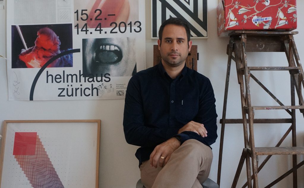
I grew up in Tel-Aviv and from a young age, I was really into music & computers. but when I was 13-14 years old, besides staring at death metal album covers and lettering, I was more into playing football than drawing or painting. My parents had nothing to do with art or design and I discovered that’s what I would like to do as a young adult in my twenties.
When did you first get involved with design?
Growing up in the middle east of the pre-internet era, my main exposure to design and art, as cliche as it sounds, was via record/cd sleeves which I loved to investigate.
Design culture was pretty much non-existing in my environment back then. And Israel, as a young state, did not have a design tradition of its own. Record sleeves were pretty much my main window to graphic design and art.
In my early twenties, my interest in design grew and I decided to apply to the Gerrit Rietveld Academy in Amsterdam. My studies were my first serious encounter with design practices and typography.
The Rietveld, even though it’s a school with a Dutch design heritage, is very much a multicultural institution. While studying there I was exposed to different, sometimes contradicting, disciplines both from my teachers and the other students.
Is there any work you’re particularly proud of? And why?
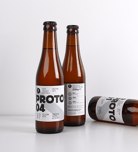
One project I really liked working on recently was the identity for Brussels Beer Project on which I worked on with Coast. This was my first project as a newcomer to Belgium and I was at once, exposed to the Belgian world of beer of which I knew very little of beforehand.
BBP’s unique concept of co-created beer presented 2 main challenges.
The design had to be adjustable to any name they would come up with in the future. At the same time, since the name is changing and new brews go to market quite often, the bottles had to be easily identified on the shelf as belonging to the same brewery.
The solution was to put the focus on the graphics system rather than on the logo or the name of the brewery, unlike what most traditional beer brands do.
Diagonal bars were chosen as a reference to the voting & choosing of brews. A simplified version of the beauty pageant ribbon.
I thought that was a funny idea and quite appropriate for a brand that wishes to challenge the traditional beer market with it’s brewing monks and Gothic style lettering.
A Belgian designer I talked with later told me he found the design to be very Belgian which I think is very interesting considering I had no intention of making it specifically Belgian.
Anyway, I am very happy to see the beers everywhere around town. I think they did an amazing job with their product and I’m glad I could contribute my share to it.
In your view, what were your biggest challenges?
My biggest challenge is taking care of the mundane financials of running a design studio. I’m awful at that. My accountant hates me.
Another challenge I have is making sure design guidelines are maintained after the initial launch. Making sure that the created brand is implemented appropriately.
What inspires you?
Everything does but that’s a boring answer. I’m often inspired by practices that are common in other fields, such as cooking, sculpting or science. Quite often I would “borrow” those practices/concepts and try to implement them in my work.
It’s not necessarily something you’ll spot in the final design but I’ll use it as guidelines to create the design.
I like to have something objective to lean on, some boundaries or framework. Also, I love the feeling of creating an invisible link between separated fields. Sort of like digging a tunnel between two water puddles and allowing the water to flow and mix.