I remember as a child I spent a lot of time drawing diagrams of cars that had all sorts of weapons like tomato sauce squirters, thumb tack dispenses, laser beams and flame throwers. These drawings all featured a car in side profile with lots of arrows and notations about how all my imagined mechanisms would work. They were quite detailed drawings and looking back, I guess these were my first forays into attempting to express and communicate my ideas visually.
It wasn’t until I was about 15 that I was introduced to the world of design and the idea that I could make a career solving problems visually. After high school I completed a two-year foundation course and obtained a Certificate in Art And Design. I was then accepted into Swinburne University in Melbourne where I graduated with a BA in Graphic Design.
Not long after graduating I was hired by Tomato’s John Warwicker and Lab Architecture Studio to work on the Federation Square project.
Federation Square was Melbourne’s new city square and at the time, the most important cultural and civic project being implemented in the city. Federation Square includes the National Gallery of Victoria: Australia and The Australian Centre for the Moving Image.
I worked on this project for five years designing the signage and graphic work. Once that project was completed I started working for myself and have been doing so ever since.
Can you tell us something about your work process?
Working under the tutelage of John Warwicker for five years taught me about discipline and the visual realisation of ideas.
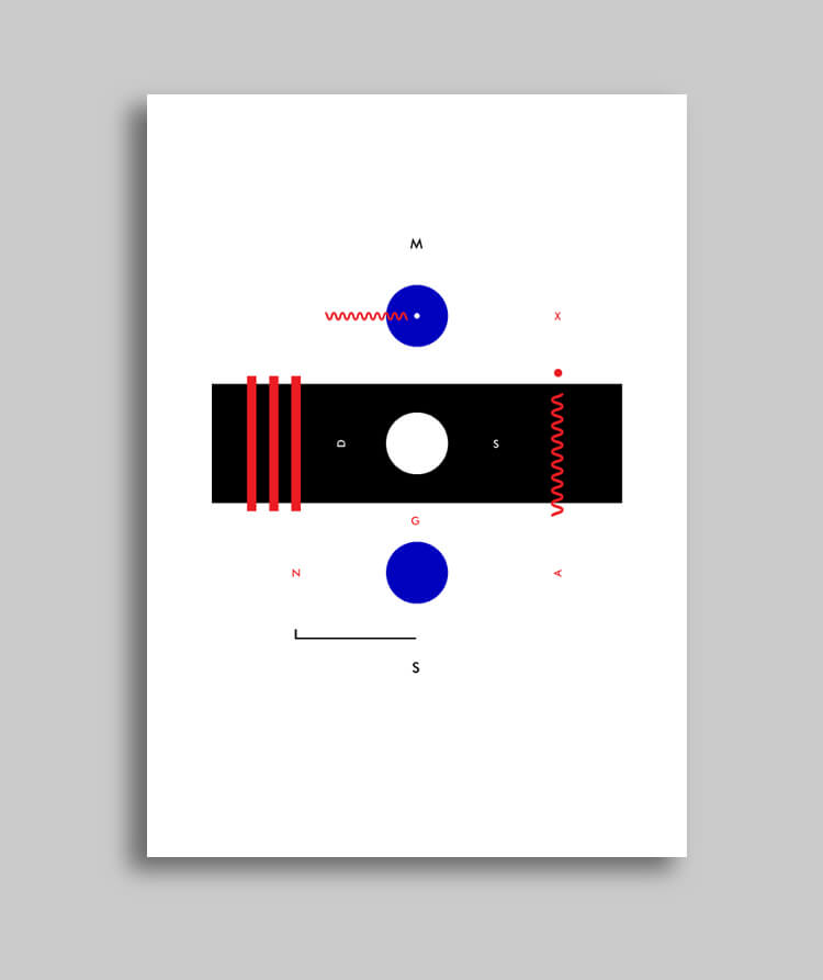
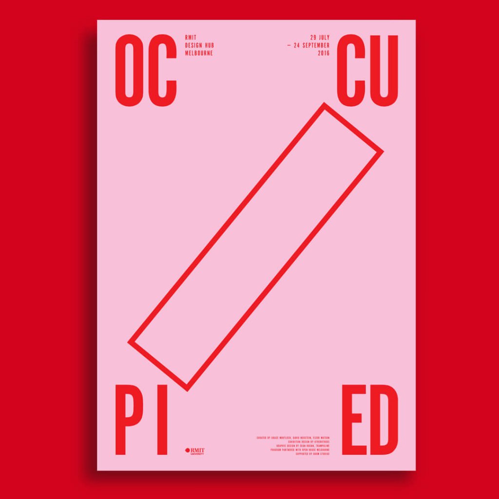
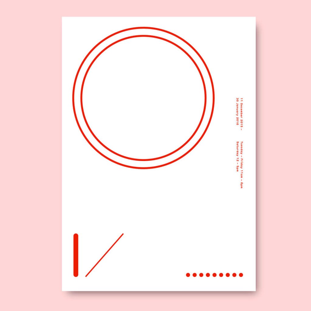
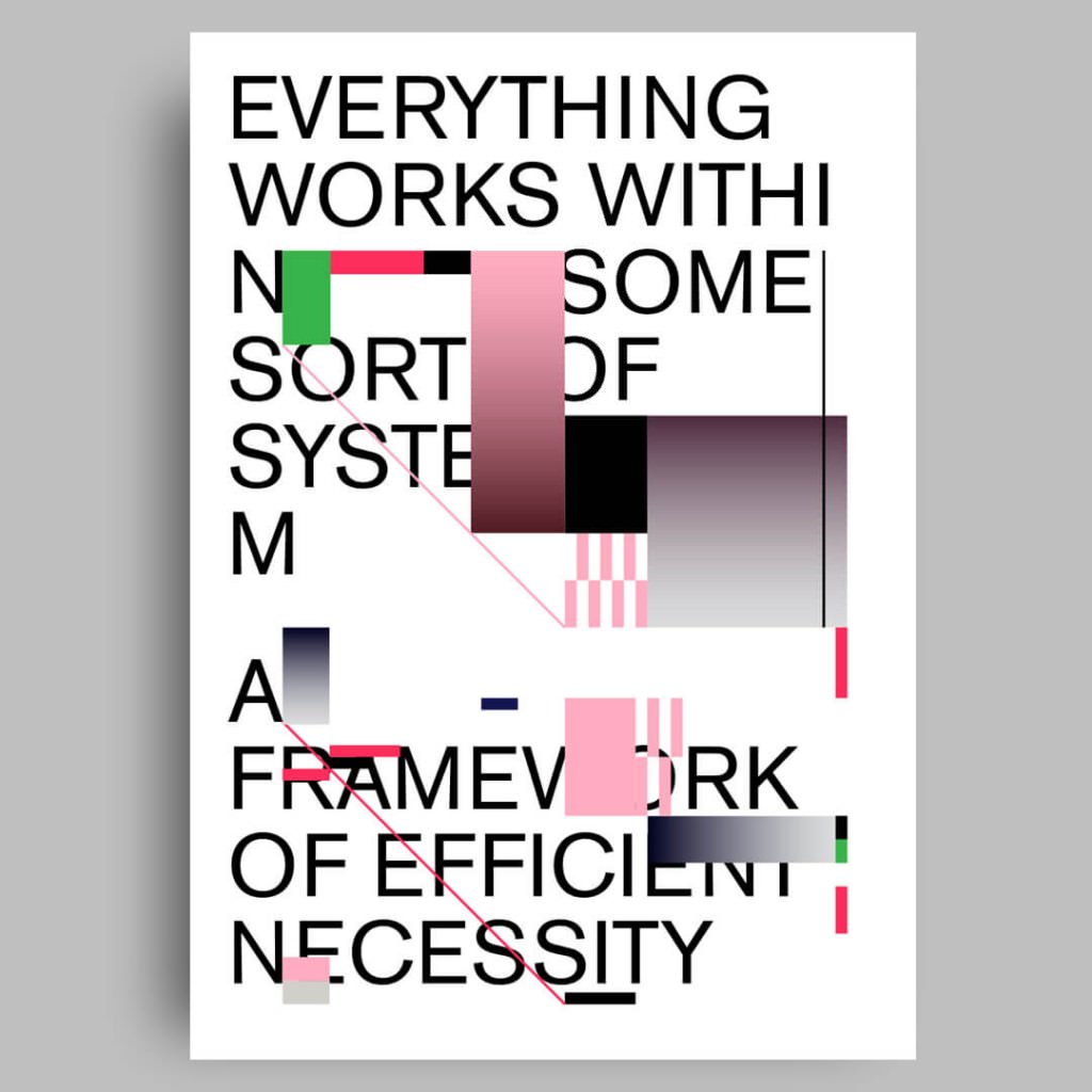
My process always starts with the idea. Ideas are about connecting disparate thoughts and knowledge in a way that opens up new creative directions and opportunities. I generally begin projects researching and learning as much as I can – often from very different inspirations and sources. I then begin to distill those ideas down to a visual language. Once I have this language I begin working with how best to use and express that visual language. I often ask myself during this process ‘why is that there?’ or ‘is that needed?’, so I start to reduce the idea to its bare essence until I have created something that is hopefully, intriguing, innovative, unique and with any luck, a little ambiguous.
Ambiguity in graphic design is not often explored enough. The idea of graphic design is to communicate and ambiguity doesn’t fit that model so neatly. I’m intrigued by multiple readings or the openness (to interpretation) of work. I think this adds depth and interest to a piece.
I also make sure that each day I make some contribution to my own ideas and work. Each day I set aside time to paint or write or do something that continues with my own studies and development as an artist and designer. This is a fundamental aspect of my overall process – away from the restrictions of client-based work.
What is the influence of music in your work?
My mother is a classically trained musician and educator. Both my parents have a love of jazz, rock, pop and folk music, so I was surrounded by quite a broad range of musical styles growing up. I’m still deeply interested in all forms and styles of music and I probably listen to around eight hours of music a day. Because I predominantly work alone, it provides a wonderful companion.
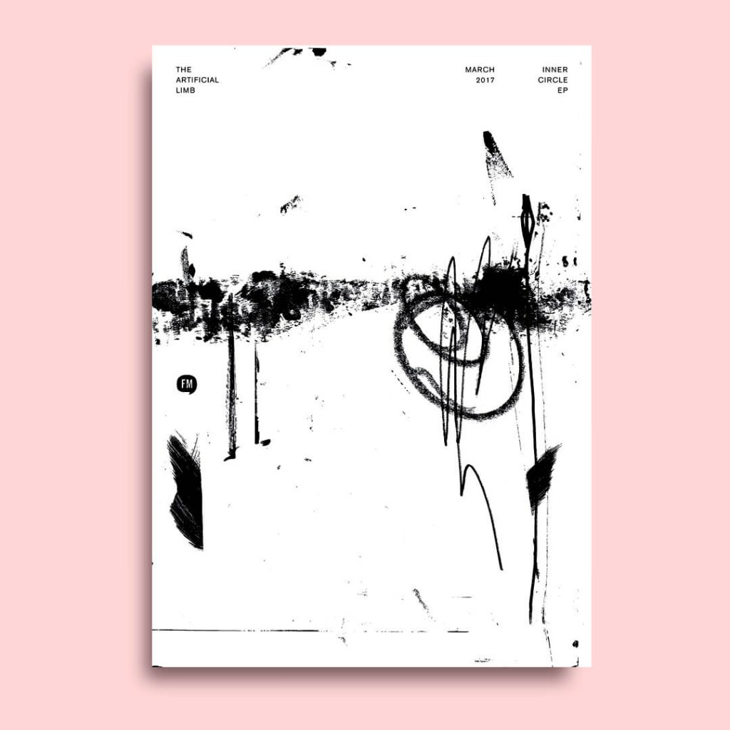
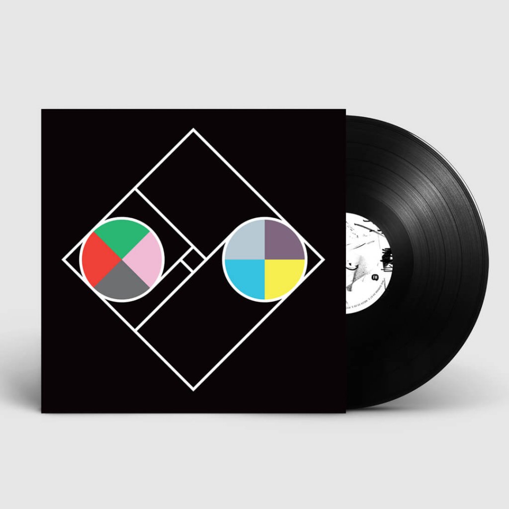
I have been a huge supporter of electronic music for the past 25 years and this seemed to run parallel with my own initial explorations with the computer. So there was a synergy right away with the platforms and process of both these creative forms. Electronic music provides a sympathetic and relevant sound for the new digital age, and the computer has altered the entire mechanisms of graphic design: allowing for new processes in the creation of visual and printed works.
Music, like visual work and colour, is a language unto itself and it is so integral to describing our understanding of the world around us. It communicates in a different way to the spoken word and its ambiguity evokes a range of human responses. For me, there has always been a direct link between music and visual art and it’s no coincidence that we use the same words to describe these languages: tone, harmony, balance, arrangement, accents, blend, contrast, composition, rhythm etc. I’m always trying to understand how a musician interprets and uses these terms in composing sound and I try to apply that thinking into much of my own work.
Simply put, music makes my world and my work better.
How is the design scene and the relationship with clients in Australia?
This is a tricky one to answer as I’m not across the design scene throughout Australia, but here are some of my observations:
We have some fantastic designers in Australia and the design community works hard at providing a platform for discourse through events and workshops etc. This is all good and very healthy in creating a dynamic and forward thinking industry.
One thing I have noticed (and I don’t believe this problem is endemic to Australia) is that there seems to be a slippage point between designers and the wider community, including the business sector. I think it’s partly an education issue and the fact that we have a government that has devalued design and the arts over the years.
I have visited places like Tokyo and Copenhagen, where it seems the population is taught about design from an early age and it is respected and understood. As such, it pervades every aspect of people’s lives – from the chair they sit on to the posters on the street. As a nation we need to integrate design education from an early age, so in this era where Australia moves away from the manufacturing industry, we adapt by nurturing, supporting and encouraging a new generation of design innovators.
I must add that in recent times the ‘design’ voice has started to emerge here. We are seeing curators from major galleries and institutions include design in their exhibitions and this is a great move forward. It’s the first step in engaging and educating the wider population in the role design plays in the everyday and how it impacts their lives.
How do you determine that one of your works finished?
As I mentioned before, I usually start with an idea or selection of ideas. When I start working up the visuals I can go through many, many iterations before I even begin to get something that is starting to work and be responsive to the idea. I find I then usually begin a process of reduction to see how I can still communicate the idea with as little as possible. It’s often a process of adding and subtracting until I feel I have something that I am satisfied with. I think when I can succinctly explain (to my client) why everything they are seeing relates to a thought process and has meaning, then I know it’s finished. With client work it’s always a fine balance between designing a piece of work that challenges myself and that I’m happy with, and satisfying the clients needs.
What is the number one thing you learned in your design career?
Never stop learning and be kind, generous and thoughtful with your time and ideas. No one likes an asshole!
Head over to Sean’s website to see more of his work.

